
Colour Series: Yellow
You could be using more colour throughout your home, I’m sure of it.
The millennial grey and beige eras are well and truly over and it’s time to bring your home back to life with colour. However, I understand that after years of neglecting colour it can be a daunting task to start adding it back in.
I have had several clients, friends, family and acquaintances tell me over and over that they are scared of adding colour. I don’t think this is true. The majority of people want colour in their homes to some degree. What they actually fear is getting things wrong, having to redo things, wasting money and time and resources. Why? Because they haven’t done it before. And you may be in the same boat.
All of these are completely understandable worries and the exact reasons many people decide to work with an interior designer. I am acutely aware that not everyone will have access to personalised interior design services, so I want to make it as easy as possible for you to inject some colour by giving you the tools and resources you need to feel confident in your design choices.
You may have an inclination of the colours you like and dislike, but you may not be aware of how colour is used through a functional, psychological and emotional lens. So I want to take a deep dive into colour with you, giving you the insights into how an interior designer looks at colour and how I would think about adding them into a space.
I am on a mini mission to equip you with a bit more colour knowledge in order for you to gain more confidence in using it throughout your home. And this week I am going to start with the colour yellow. So let’s dive in!
The Psychology of Yellow

Image Credit: Dupe Photos - Sofía Carmona
Yellow is energetic, optimistic and attention grabbing. It reflects a lot of light which makes it a very stimulating colour and it can be used in settings to promote clarity, memory and creativity
Positive attributes of yellow are:
positivity
joy
intelligence
curiosity
creativity
Negative attributes include:
anxiety
deceit
being cowardly
being critical and
lacking emotion
I think it’s important to understand where we see colours referenced in nature, as this was our first experience with colour as humans and has therefore deeply affected the way we connect with these colours.
Yellow is heavily associated with the sun. And what gives you a mood and energy boost more than that first ray of sunshine hitting your face? If you’re a Brit you will be all too familiar with the wonder and joy felt when the grey clouds part and the sun greets us during the spring and summer months. It’s really no wonder then that yellow brings a burst of energy, positivity and optimism. Yellow can apparently release serotonin in our systems too, highlighting its association with happiness and joy.

Image credit: Dupe Photos - Sivan Weitz
And you can find many other joyous places where yellow lives in nature, from goldfinches to bright flowers and buzzy bees. Yellow screams spring.
Another element yellow is heavily associated with is gold. Gold has been a desired metal for centuries and heavily referenced in art work. Yellow has been used to achieve this golden look in artwork throughout history.
Artists’ use of yellow has also influenced its cultural meaning over time. Giotto’s ‘Kiss of Judas’ is a good example, which shows Judas in yellow, conjuring feelings of deception and greed.
One of my favourite artists, Vincent Van Gogh, loved the colour yellow, famously using it through a series of paintings from his sunflowers to the wheatfields and creating luminosity and wonder of ‘Starry Night’.
So with that knowledge and background of yellow, how would I use this in an interior design project? Let’s start with residential properties…
How to use yellow in your home
The front door is the perfect opportunity to experiment with yellow. It’s a warm and happy welcome home after a long day, it will stand out so you will always know which house is yours, that’s for sure, and it allows you to introduce the colour without being surrounded by it all the time. I also love the idea of using it in the recesses around windows, which can accentuate the sunshine that beams through. Yellow also draws the eye so using it on window frames themselves can encourage people to check out the view.
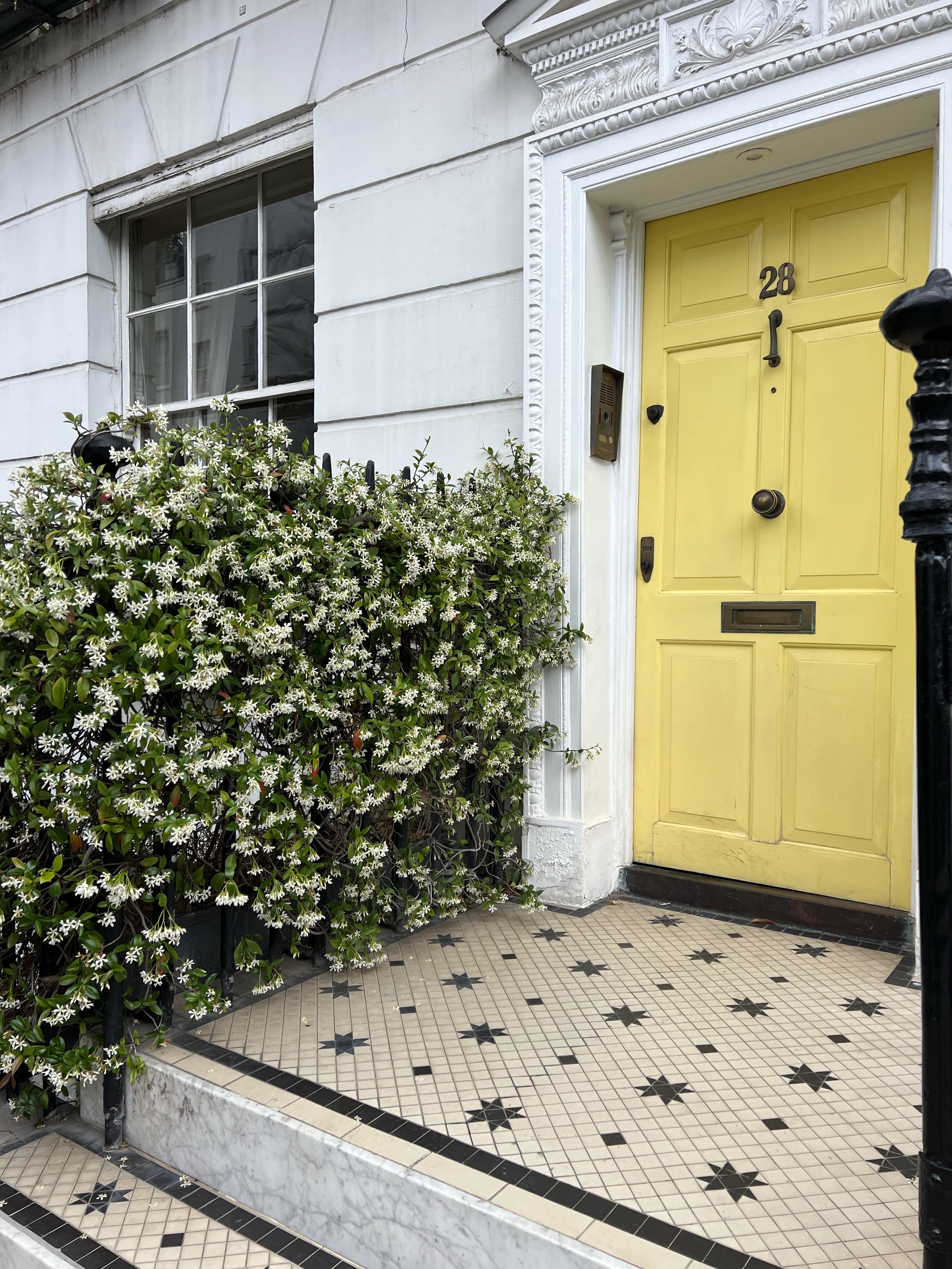
Image credit: Dupe Photos - Christa Niner
Moving in to the home I also think this is the perfect colour for an entryway for similar reasons to the front door. It’s a bright welcome, gives you an energy boost, but you’re not spending a lot of time in the space so it shouldn’t become too overpowering. The biggest problem with yellow is going too far, as some people may find the colour too overpowering and energetic to sit in for long periods, making circulation spaces a great spot if you’re concerned about this issue.
I also love yellow in the social spaces in a home such as dining and kitchen areas where people tend to gather. Since it is so energetic you may want to avoid using it as much in spaces where you want to relax and unwind such as living areas and bedrooms. However, if you use your living room more for social gatherings this colour will work really well so you need to consider the function and how you intend on using the space.
Work and creative spaces in the home can benefit from the mental clarity, creativity and curiosity that yellow invokes. I also think yellow could work really well in a bathroom, depending on your desired outcome. If you want to feel fresh and energised and use the bathroom mostly in the mornings, yellow can be a great way to start your day.
Of course all of this is personal preference and yellow can work in any setting depending on the tone you go for, the general palette and your intended use for the space. This is just a general guide to give you some assistance and inspiration.
Image credit: Dupe Photos - Rosie-
How to implement in your space
Using colour, especially something as bold and energetic as yellow can be a difficult process. So let me break down some ways to introduce the colour depending on your comfort level:
New to colour: Stick to accessories
If you’re trying out colour for the first time it’s best to introduce little bits through home décor pieces that can be easily replaced (responsibly, of course). Try finding second hand vases, crockery and glassware for fun splashes and look out for fabrics featuring pops of the colour, perhaps a set of placemats? Remember that tone and saturation play a big part in how bold a colour feels too, so if you want to play it on the ‘safer side’ maybe look for softer yellows, such as the currently trending butter yellow.
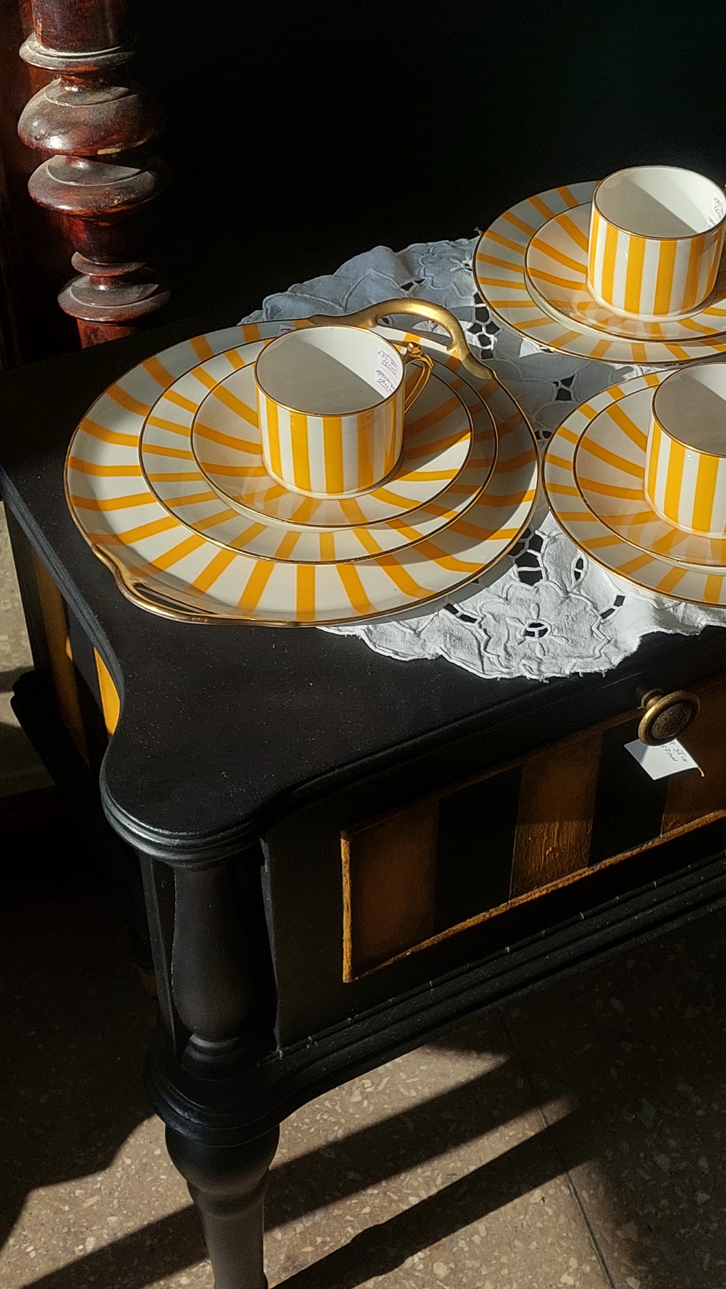
Image credit: Dupe Photos - Lada Balakireva
Love the colour, but not committed
If you’re not quite at the stage where you want to be putting a lot of time, effort or money into introducing yellow into your home, but you love it a lot and want more of it, why not add it to larger décor items? Think curtains, rugs, duvet covers. These items are in theory still easy to replace if you think it’s not right, but take up a larger surface area so make more of an impact than just small accessories.
Want to make a statement
If you are locked in for yellow it’s time to go bold with statement furniture pieces. Add in a bold ochre velvet sofa or yellow kitchen cabinets. Another way is of course to introduce it to the walls, either with paint or finding a beautiful patterned wallpaper showcasing the colour. I also love the idea of a statement ceiling. This could be great fun with yellow and may actually be less overwhelming using just on the ceiling compared to all four walls.
How to use yellow in commercial spaces
Yellow works great in offices and workspaces but I wouldn’t go overboard or it can have the opposite effect on employees.
I also think this colour is perfect community spaces and creative spaces where people are looking to spark creativity, curiosity and conversations.
It’s a great colour to use if you want to grab your customers attention or make a statement so it can work well throughout retail and hospitality spaces too.
Yellow is renowned for its use in road and warning signs so it already has the reputation for being good for wayfinding purposes, thanks to its attention grabbing nature. Just be aware that it is used with black to highlight warnings and caution, so depending on your desired outcome you may want to avoid pairing it with black.
If you find yellow overpowering or feel you have used too much, consider the palette as a whole. Cooler tones will help calm the warm and energetic yellow. Wood tones and natural stone also help to ground the colour in its settings.
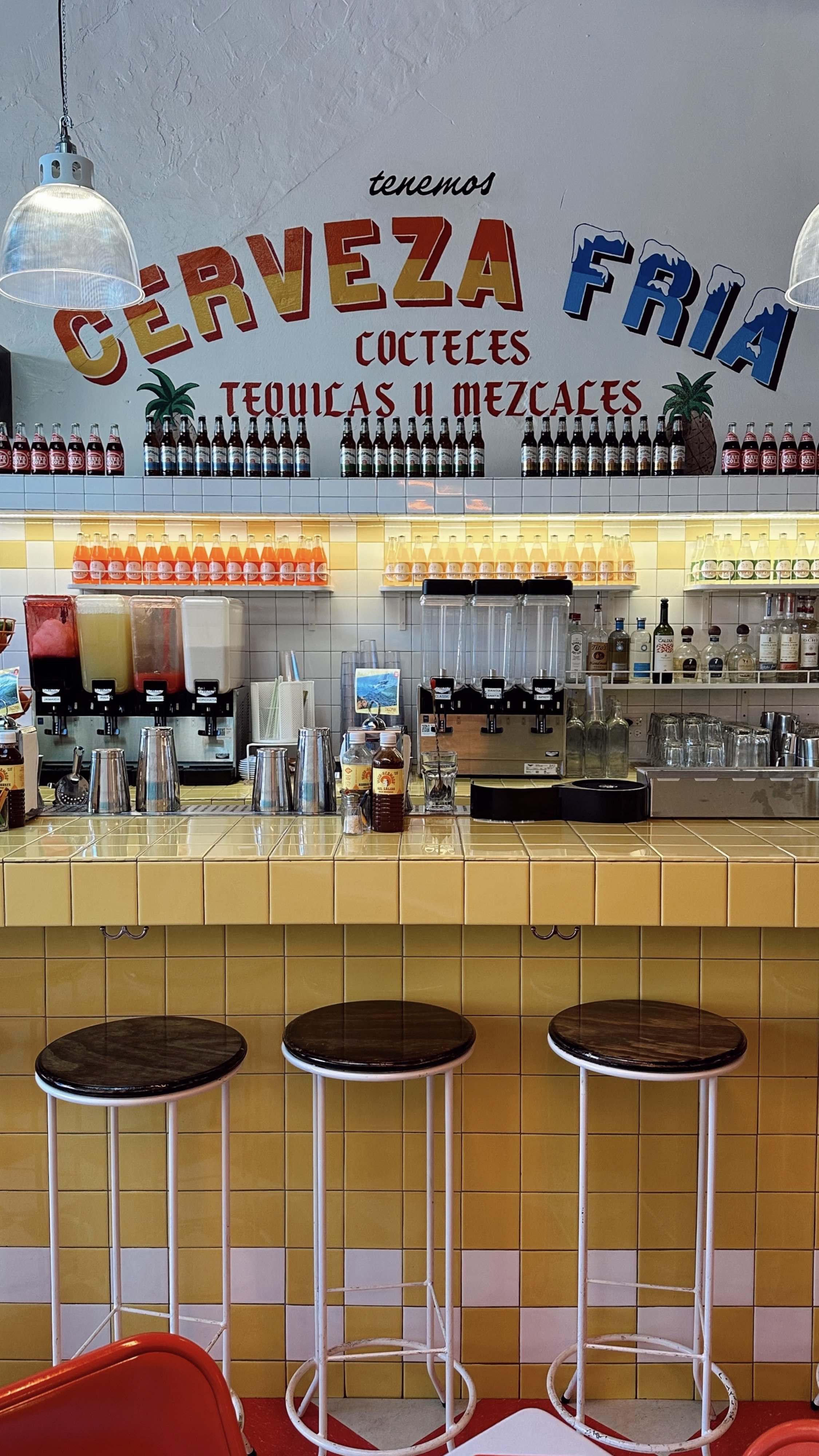
Image credit: Dupe Photos - Sivan Weitz
Want more inspiration?
I hope this gave you some guidance and inspiration to go ahead and begin your journey to adding colour to your space. There really is no better way to introduce an easy dose of joy into your interior than a pop of yellow.
If you want some more inspiration, I have curated a Pinterest board featuring amazing spaces using yellow in creative ways.
I’ll be sharing loads more tips on colour, layout, design styles and more in my email newsletter, The Design Diaries. This week’s theme is all about yellow, and I’ve pulled together some of my favourite finds to give you a little inspo. If you sign up now, you’ll also get free access to my Home Project Tracker Notion template to help you stay on top of your home updates.
References: